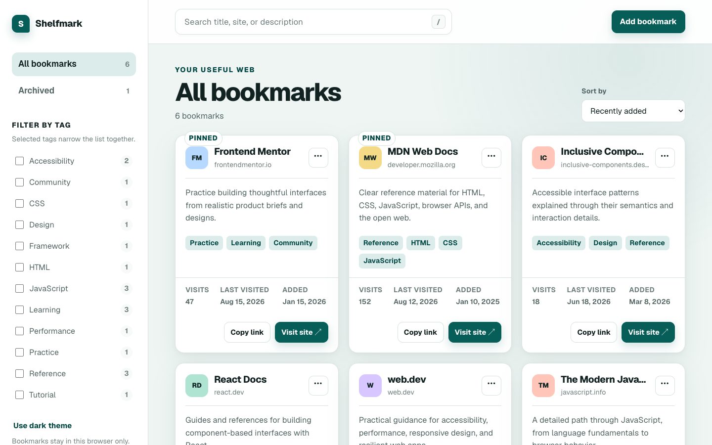
Shelfmark
Bookmark manager · sample library
Stack
A place for the links worth keeping. Search, organize and return to a personal library.
The actual Portfolio viewport stage, Working on rail, material cards, search and OR technology filters.
Previewing Shelfmark · system mode. Examples keep their state while you compare.
Both original modes, adapted for shared controls.
Authored by Royer Adames
Show
2 projects
Bookmark manager · sample library
Stack
A place for the links worth keeping. Search, organize and return to a personal library.
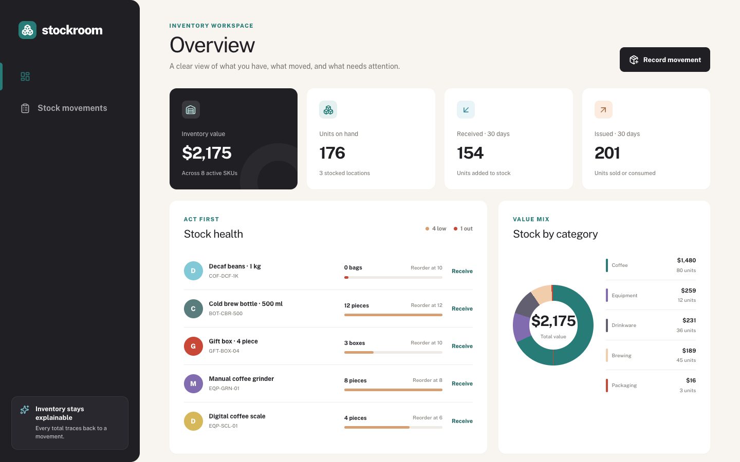
Inventory control · fictional demo data
Stack
A clear view of stock, movement and the work that needs attention. The captures contain seeded fictional inventory.
Common mistakes this block prevents, and how.
In an initialized shadcn project, run this command. Keep your existing Radix or Base choice; these components declare their own dependencies.
npx shadcn@Copies 15 source files + shared token CSS. No catalog or Storybook dependency.
The component imports its small foundation stylesheet. To apply Shelfmark, add its theme:
npx shadcn@Import components/royer/theme-shelfmark.css in your app’s root stylesheet or layout. Set data-project-theme="shelfmark" on the root HTML element and data-mode="dark" for dark mode. Use your existing theme provider to resolve system preference.
Updates are deliberate. Commit local changes first, inspect shadcn add --diff, then review and merge. Never overwrite a customized component blindly.
@fontsource/geist, @phosphor-icons/react, clsx, motion, tailwind-merge
portfolio-exhibition.tsxcn.tsportfolio-badges.tsxportfolio-card-frame.tsxportfolio-card-stills.tsportfolio-finder-query.tsportfolio-image.tsxportfolio-media-state.tsportfolio-project-card.tsxportfolio-project-still.tsxportfolio-tip.tsxportfolio-types.tsportfolio-working-on.tsportfolio.csspluralize.tsxLoading source…